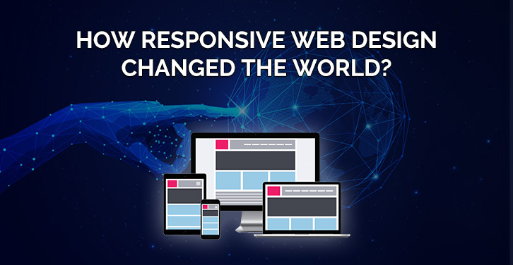
How Responsive Web Design Changed the World?
There was a time when almost all the screen deices were of the same size and hence websites were designed with a then relatable approach. But somehow, ever running time has called for a change and then comes Responsive Web Design. This term has changed the world magically with its impact on businesses through the internet.
Well, only if you are unaware of the meaning of Responsive Web Design, here it is:
Responsive Web Design is an approach of designing websites in such a way that all the web pages render well and adapts themselves according to the screen size of the device they are being surfed on. Responsive layouts automatically adjust and adapt to any device screen size, whether it is a desktop, a laptop, a tablet, or a mobile phone
In simpler words, it means an approach of designing a website so flexible that it can fit itself into various screen sizes.
The History
Everything in this world has a history. The word Responsive was officially used by Ethan Marcotte for the first time in May 2010 article on A List Apart and is known for giving birth to the term – Responsive Web Design. But the basic concept was first used by a team of Razorfish late in 2001. The team consisting of Jan Hoffman, Jurgen Spangl and Jim Kalbach designed a layout that adapted itself to the browser viewport and that website was Audi.com.Cameron Adams also created a demonstration under the name of “Resolution Dependent Layout” on 21st September 2004. But it was Ethan’s article responsible for spreading the term.
In 2012, Responsive design was ranked as no.2 by .net magazine. Mashable also called 2013 a year of Responsive Web Design and have elaborated the same using stats about the sales of desktop and tablets.
Why we are telling you all this?
Because a change never comes instantly and takes time to get noticed. By changing the world means changing economies, individuals, businesses, and the web. Mr. Ethan gets worldwide fame, Cameron Adams rewarded with wealth and websites like Mashable which published articles about it gets traffic.
The Change
What it does in the world is that now everywhere in the world whenever any web developer or responsive website Development Company starts working on a web designing project, it is more likely to go responsive. From New Jersey to India, and Bangkok to Africa, most of the websites are developed by following a fully responsive web design.
As the mobile devices started to take over the desktops, demand for responsive websites increased. While people were going crazy and were buying mobile devices, it was a responsive web design that lets entrepreneurs think and implement business through the internet.
Today we have thousands of e-commerce and online delivery websites making lives easy in this fast-paced world and all that just because of the responsive design. Almost 60% of Internet access is done through mobile and approximately 2 billion buyers prefer online shopping. It means that a website can’t be designed solely for desktops or mobile, responsive is the savior.
Not just for companies selling products online but also for the companies having a digital presence in the name of the website, responsive website designing proved itself as the key influencer. And to support that – 94% internet users judge websites on their capability of responding (responsiveness) as per the device they are surfing it on.
Responsive Design also gave business opportunities to many digital marketing firms as they started to compete in terms of providing responsive website design & development services. And many firms are raking in a huge amount of money by providing fully responsive design services.
Few More Stats
57% of internet users won’t recommend a website poorly designed for mobile.
77% of the agencies believe that a bad website UX is a weakness for their clients.
After all that, it’s not just about the website-way of responsive web design changing the world with its capabilities. It affected the revenues and cost of the businesses. It has an impact on countries’ economies. It made things easy for people. It made the internet a helpful thing in many ways such as shopping, food, medicines, decision makings and many more.
Maybe you are reading this on a mobile device or a laptop but this article will respond precisely to your device screen. Because this page is developed on a responsive approach by a website design company in New Jersey.
